

Challenge
The proposed challenge was to design a mobile app to help those going through the hard task of studying for a public tender to organize and test their knowledge. The whole process was made during the intensive formation course in UX Design promoted by the Mergo User Experience school by our team of 6: Aline Aoki; Clarissa Vasconcellos; Heloísa Barci; Karynne Ottoni, Jeferson Bem Martins e Micheline Pimenta.
Process
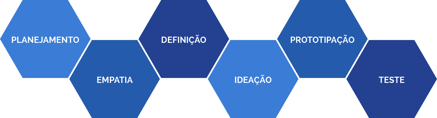
Translation from left to right: Planning, Empathy, Formulation, Ideation, Prototyping and Test
Planning
On the planning step, we did a quick research to comprehend the user that engages in tenders, their needs and their universe.
Then, we discussed and aligned our assurances, assumptions and doubts about the theme and users, so we could generate the proper content to structure the interviews.
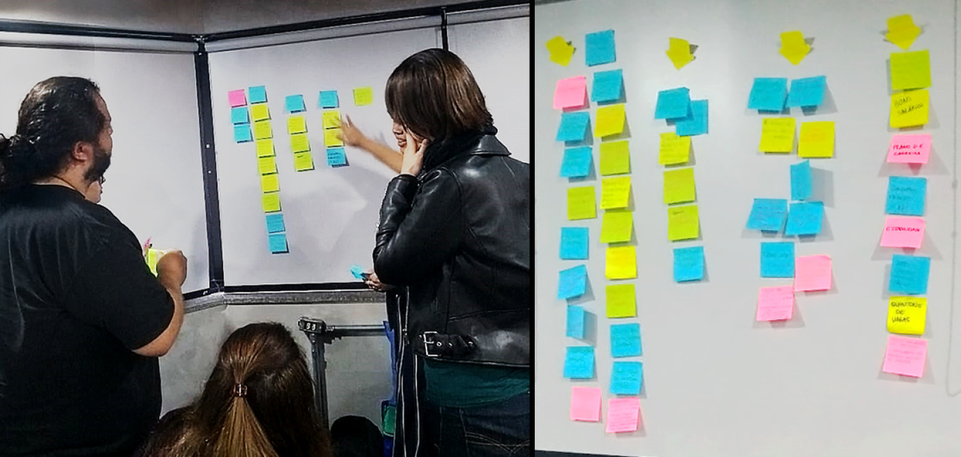
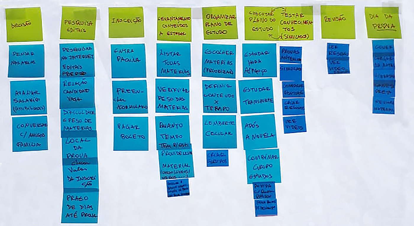
Desk Research
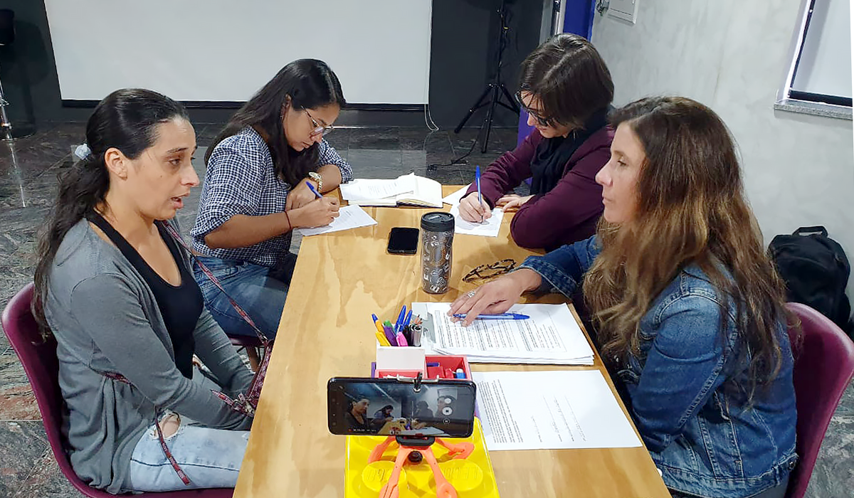
Interview
The interview was structured to obtain information about the users demographic data, how they behave, their ongoing careers, their goals for the future, their plans for achieving it and their routine both while studying and when not studying.

CSD Matrix and Interview Script
EMPAThy
With the questions ready, we started a semi-structured interviewing process to gather information to help us know the user and what were their main problems concerning the app's challenge.
PERSONA
After analyzing our collected data, we spotted a couple of shared behaviors among the interviewed users.
By putting together the collected data on interests and motivations, daily tasks, dislikes and frustrations, backgrounds and main activities and goals, we created our persona.
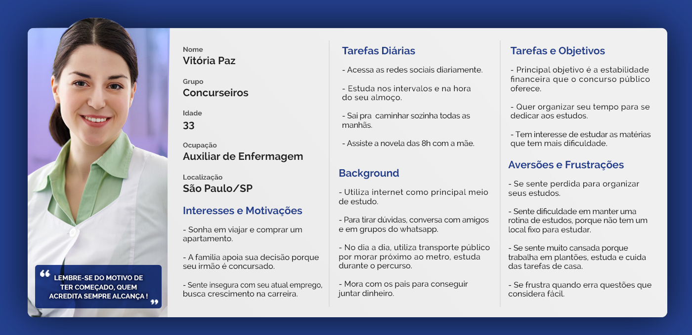
Persona
Setting
After the persona was ready, we could build the User's Journey and, through it, map all the user's contact points with our product. And after that was managed, we could visualize their opportunities, motivations, pains and uncertainty
IDEation
With all the information gathered during the planning and empathy steps, we realized our opportunities and analyzed which resources would be available for our product.
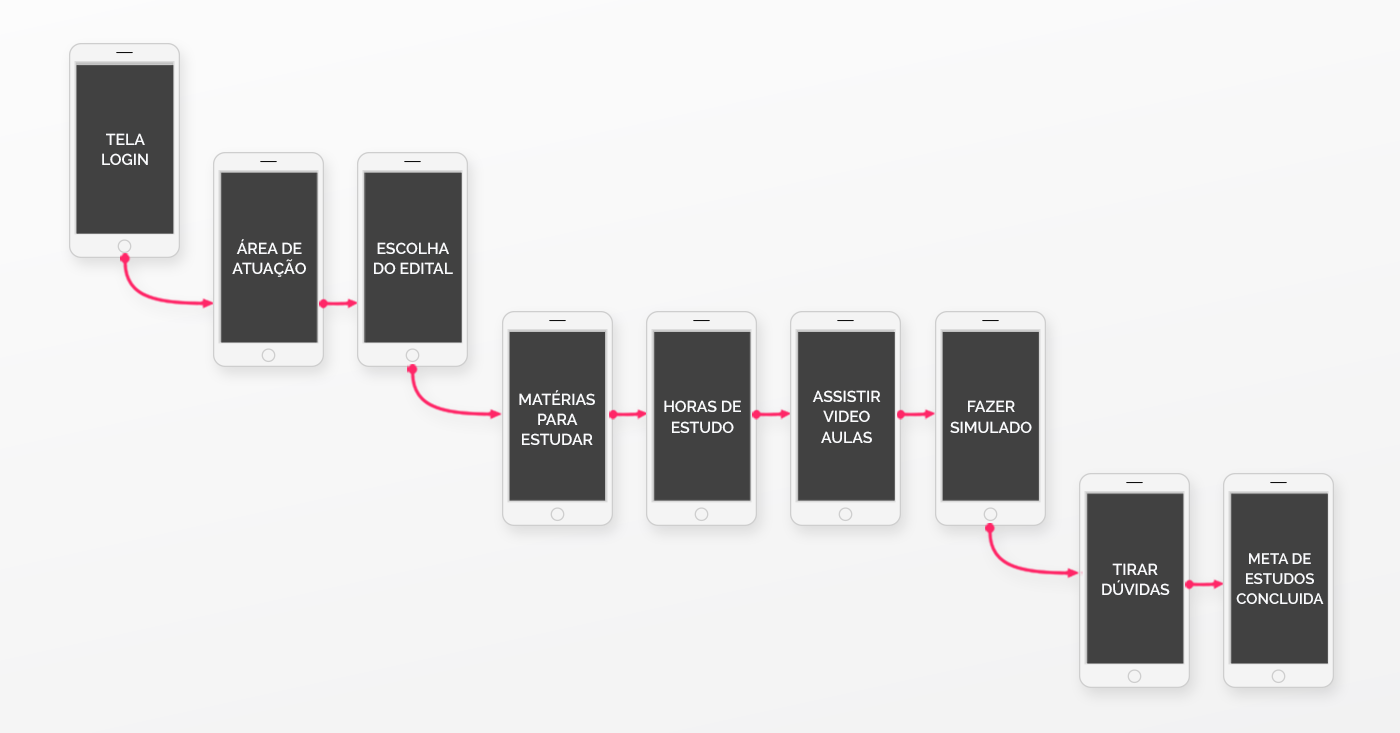
journey Flow
In this step, we defined the most efficient path for the user to access the app's features.
PROTOTyping
The screens were designed to follow the most intuitive flow for the user, by being simple and facilitating the layout's visualization and comprehension.
Both icons and graphic representations were chosen to slowly build the communication and inside logic to guide the user through the desired flow.

Paper drawn screens (Low-fidelity prototype)
From the paper drawn screens, we were able to make a browsable prototype with the Marvel app and software, so we could analyse the navigation, flow and how troublesome it was for the user to find and use the intended features of our prototype.
user test
With the prototype ready, we called for some users to make a usability test. They would have three tasks to be accomplished without input and their opinions would help us validate our intended features, comprehend the problems with the flow and layout and be sure of the general functionalities of the app.
After the user completed the test, the moderator would ask follow-up questions about their experience and opinions, and the user would suggest improvements and new features that were not yet considered.

Usability Test
Test Analysis
During the tests we evaluated the interaction of the user with the app while they described their main difficulties and notes about the app.
Comprehending and solving issues
Based on the observed results of the usability test, we discussed the misconceptions and problems with our concept and went back to the ideation step and apply our findings to a new iteration of the prototype.
We re-managed the most problematic points in the flow so we could provide the user with a better comprehension of our app and we also incorporated the inputted data to improve the points already considered positive to the users.
Medium fidelity Prototyping
After our discussion, we redid our screens with the Figma software, this time in a medium fidelity version.
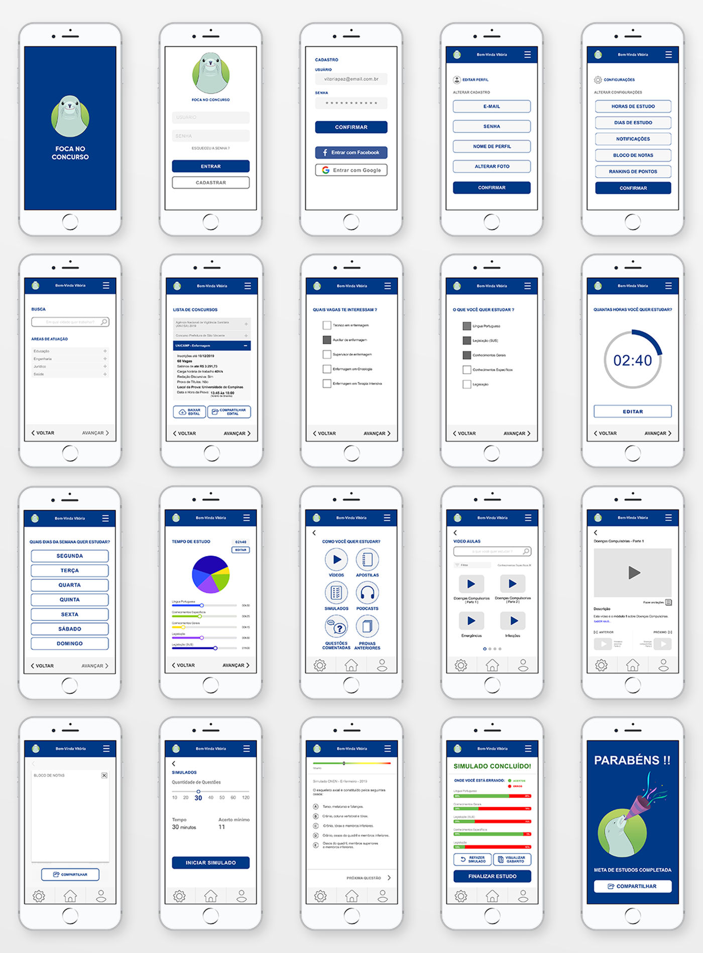
Prototyped screens on Figma
Highlighted features
Favorite features highlighted by our users during the tests:
1. manage the time for each question on the emulated test;
2. notepad to register queries, references and studied material;
3. possibility to share content and queries through email and social media;
4. emulated test results, showing the user where their main issues lie;
5. visualization of each emulated test answers, so the user can have a better comprehension of their mistakes.

Thank you
